Brand-new
Branding
for a Sustainable Coffee Shop?in the Heart of the UK
The Story
18grams is a small coffee shop concept birthed in London – a family business created from the passion for coffee and community.
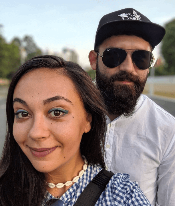
The owners, a young family, share the perfect combo of expertise for this business to grow solid and soulful: Raoul is a professional barista and Alexandra is a marketing expert.
They contacted me in 2021 to support them in bringing their concept to life through a brand focused on values, uniqueness, and relevance.
The Start
They had the naming ready. They definitely knew they want their coffee shop to be named ?18grams?. Why is that?
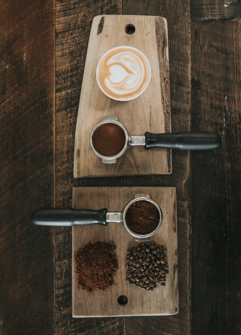
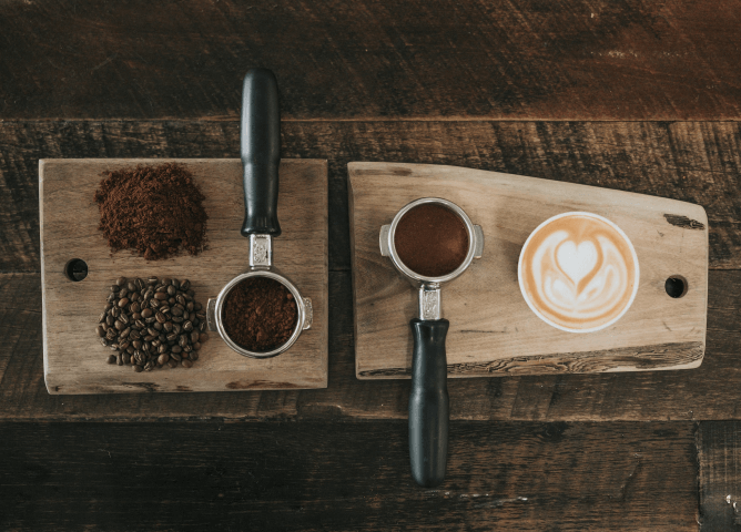
Because that is the amount of freshly grind origin coffee you put in an espresso – a relevant riddle, with digits and all. And also a naming with a nice touch for the connaisseurs, a niche they are definitely aiming for.
They knew they want to stand out through minimalism. They knew they want to impact the environment as little as possible, while also birthing this small business – in order to give life to their dream: bringing value to their community through the love of coffee and true connection.
The Research
First step: I asked the client to gather a representative list of competitors and inspirational brands in the same segment – or even beyond. I analyzed the brand & visual communication of all those companies or startups.
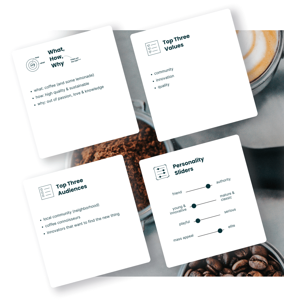
After this research, we went through the Brand Sprint workshop. A few hours and aha moments later, we had on-point conclusions on topics such as:
?What is their actual why? Or,
Why do they wake up in the morning to do this?
? What are the values of this business?
? To whom are they talking?
? How do they express themselves as a brand?
? How do they stand out?
The Concept
So, at the end of the day, what does ?18grams? want to bring into the world? High-quality, sustainable products. Shared passion, love, and knowledge.
How could I contribute for these values to transpire from the very first interaction with the brand?
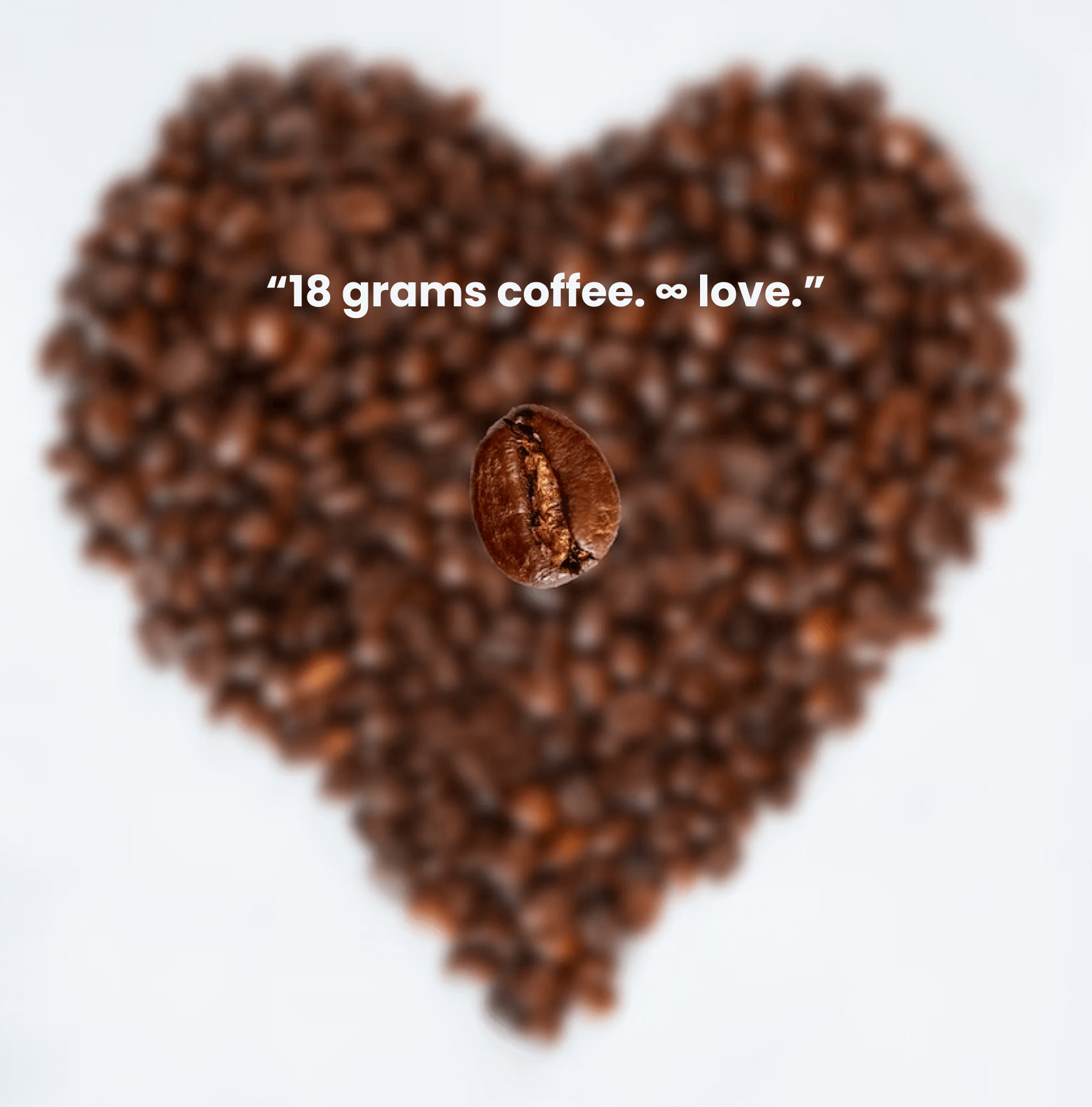
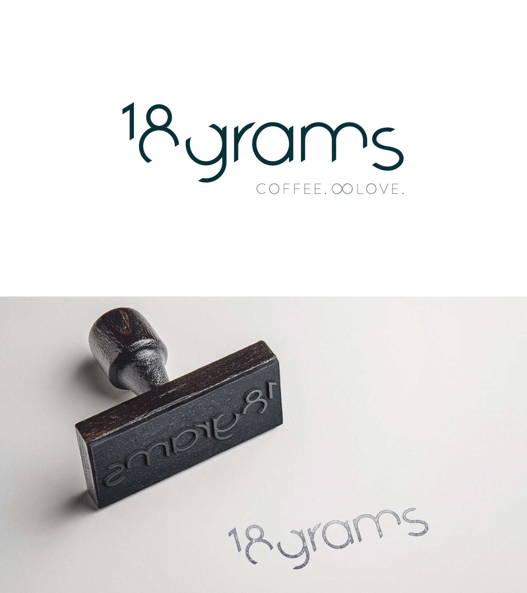
And this is how I came up with the slogan.
And further copy that supports the brand storytelling:??The math of a perfect coffee resides
in the passion for knowledge
and in the soul put into it.?
I believe that the right mixture of textual and visual can empower a brand to communicate itself in the most compelling possible way.
And this is how I came up with the slogan.
in the passion for knowledge
and in the soul put into it.?
The Results
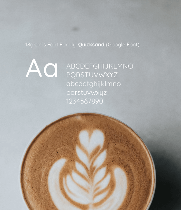
Beyond the slogan – the textual result of the design thinking, the logo was created. We identified that a sans serif font would be suitable for the personality of the brand.
The client and myself decided together – considering also the BSW* conclusions – that I would create a logo with logotype only – and no logo symbol. Such a visual identity would respect minimalism and the ?good design is no design? principle.
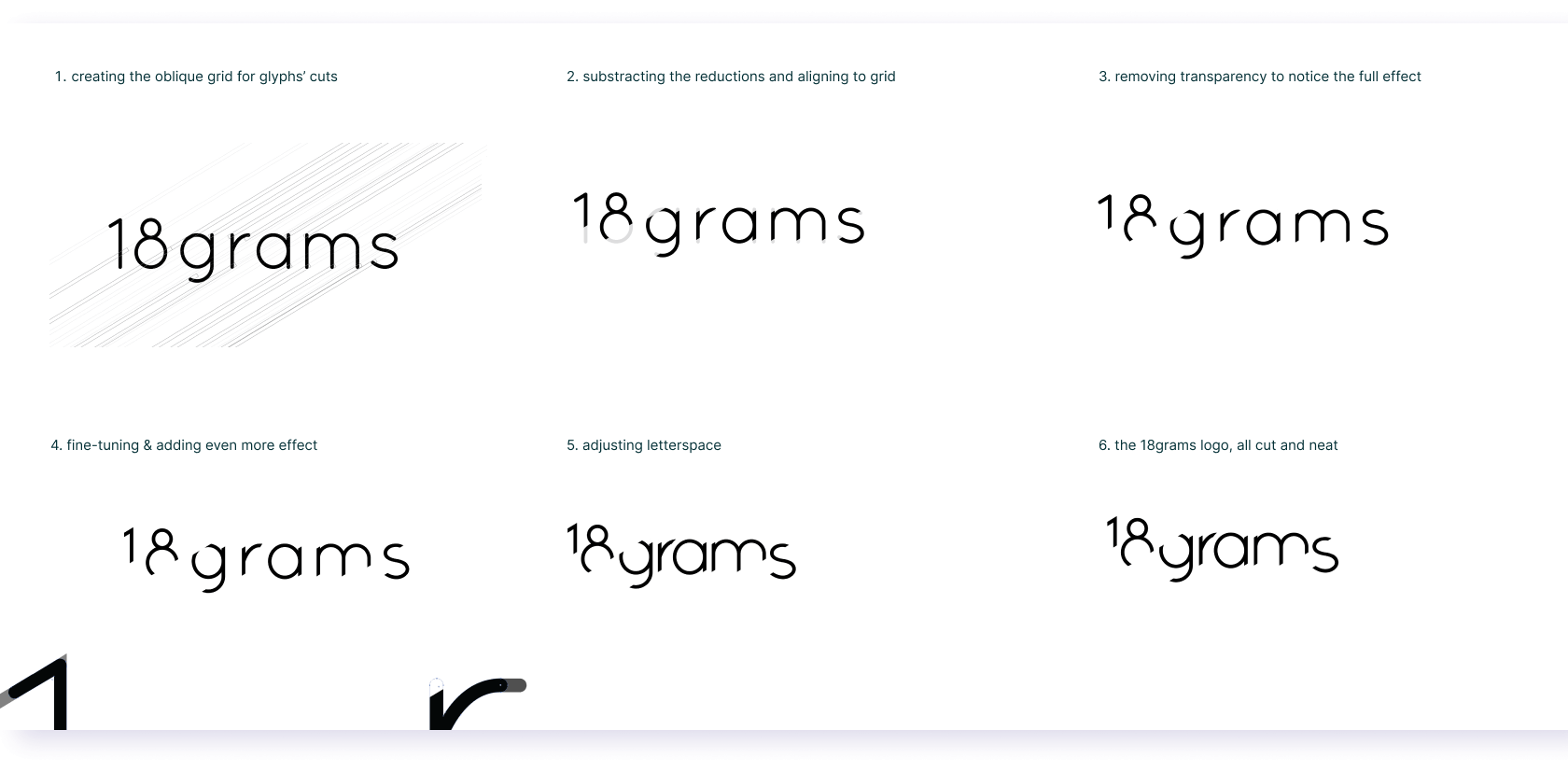
The logotype has a, so to say, oblique grid that it is based on, and the letter spacing has been properly adjusted for each glyph, in order to achieve the cut&wiped aspect of the logotype concept.
In the upcoming images you may notice a step-by-step presentation of the logo construction – that is, literally, clean-cut.
Behind The Scenes
Here you may observe some draft concepts done at the beginning of the creative process (slogan included) – the ones that I needed to ?get out?, so that they get out of the way of the real, suitable branding. Embracing the process. : )


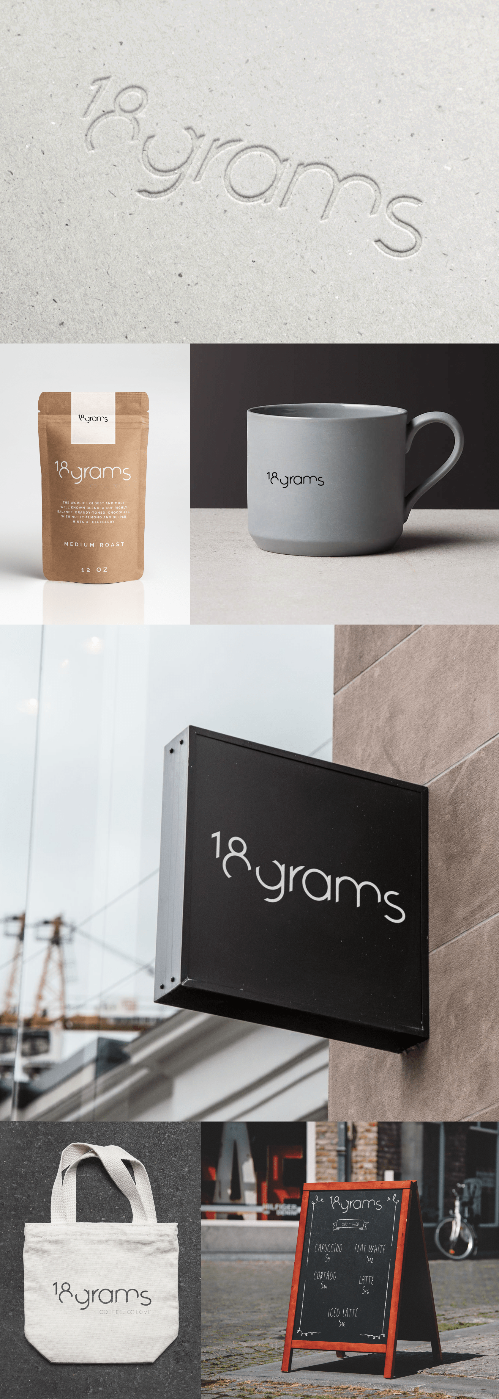
The Scene Itself
The Next Steps
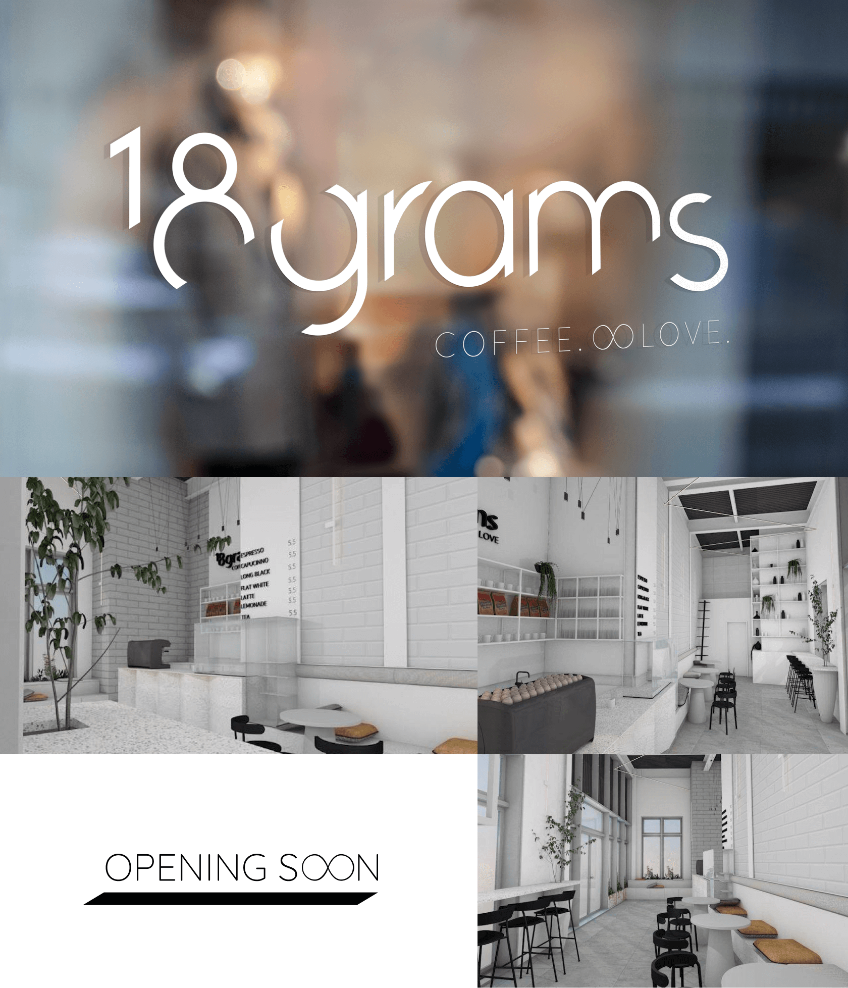
At the moment, the client has found the perfect spot in London to open the coffee shop. Alexandra and Raoul are working at the interior design with a specialist. So, 18grams is a baby business and it is just starting to sprout. And it does not intend to force itself upon others, or the environment.
It was quite refreshing when, in one of our recent syncs, the client and I concluded that we don?t even need to print out any menus, business cards, and such. There?s no need for that. Our perspective on the sustainability aspect of the business is that we are co-creating – and so we consider the impact of every design decision we reach together.
Natural lemonades with peculiar ingredients, handcrafted ceramics, coffee workshops for connoisseurs, social inclusion programs – are a few things that the client foresees bringing a positive impact to the local community of 18grams. And I look forward to bringing my contribution to this, from my creative strategist shoes.
Case Study Summary
Client Location:
London
Business Type:
startup, family
Collaboration Type:
remote, freelancing (specialist & consultant)
Brand Values
? community
? innovation
? quality
? sustainability
Audience Segment
? local community (neighborhood)
? coffee connoisseurs
? innovators that want to find the new thing
What does the brand do?
? main: coffee
? secondary: lemonades, ceramics boutique and coffee connoisseurs workshops
Service Provided
“>
? “>the Brand Sprint Workshop
? brand strategy
? research
? brand identity:
? textual – slogan
? visual – logo
? brand mini-styleguide
? brand implementation
(stationery, exterior and interior signage etc)
All the visual assets presented in this case study are the intellectual property of
18grams ? All Rights Reserved.
Thank you for allowing the use of the imagery to showcase my work.
Credits to mock-up creators and unsplash.com photographers for putting their work out there.
Many thanks – my portfolio looks pretty also because of you.
roxana.oroian at gmail.com
Thanks for reading – I hope it was relevant.
On the website you can discover
a few more case studies.
I consider all the results of my work
a co-creation alongside my clients.
The selection of studies is just a glimpse
of what my creative process can be.
Stay imaginative and open.
We can go places together.