This is how, after 18 years of activity, Daiana got to the point where she wanted to celebrate this beautiful age. In Romania, it is the official age when a teen becomes an adult.
Heidi wanted to express that it is a consolidated brand, with a strong visual identity, in line with the brand values, the brand personality, the tone of voice and the brand archetype.
Beyond that, Heidi also wanted for the re-brand to express its humane perspective upon the business environment. For a preschool educational institution, Heidi is quite large. The buildings it resides in are also big, old buildings, that used to contain other public institutions, in the past.
This is why the re-brand also needed to contain Heidi’s natural, joyful way of being, beyond its size and maturity.
The Research
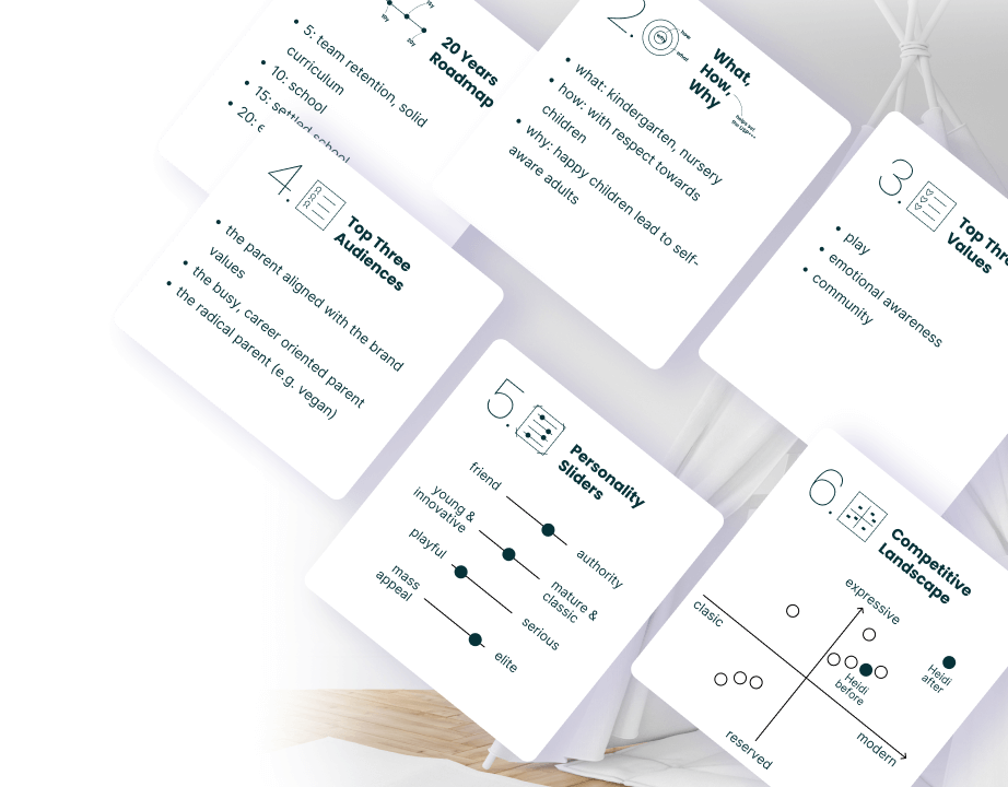
First step: our Brand Sprint Workshop: 3 stakeholders - including Daiana, and me as the facilitator. Almost 3 hours later: we identified the values and the brand reason of being. We put the pin on the most relevant audience segment. We also detected some pain-points. We had the conclusion that the naming did not represent
the brand.
Next steps that followed:
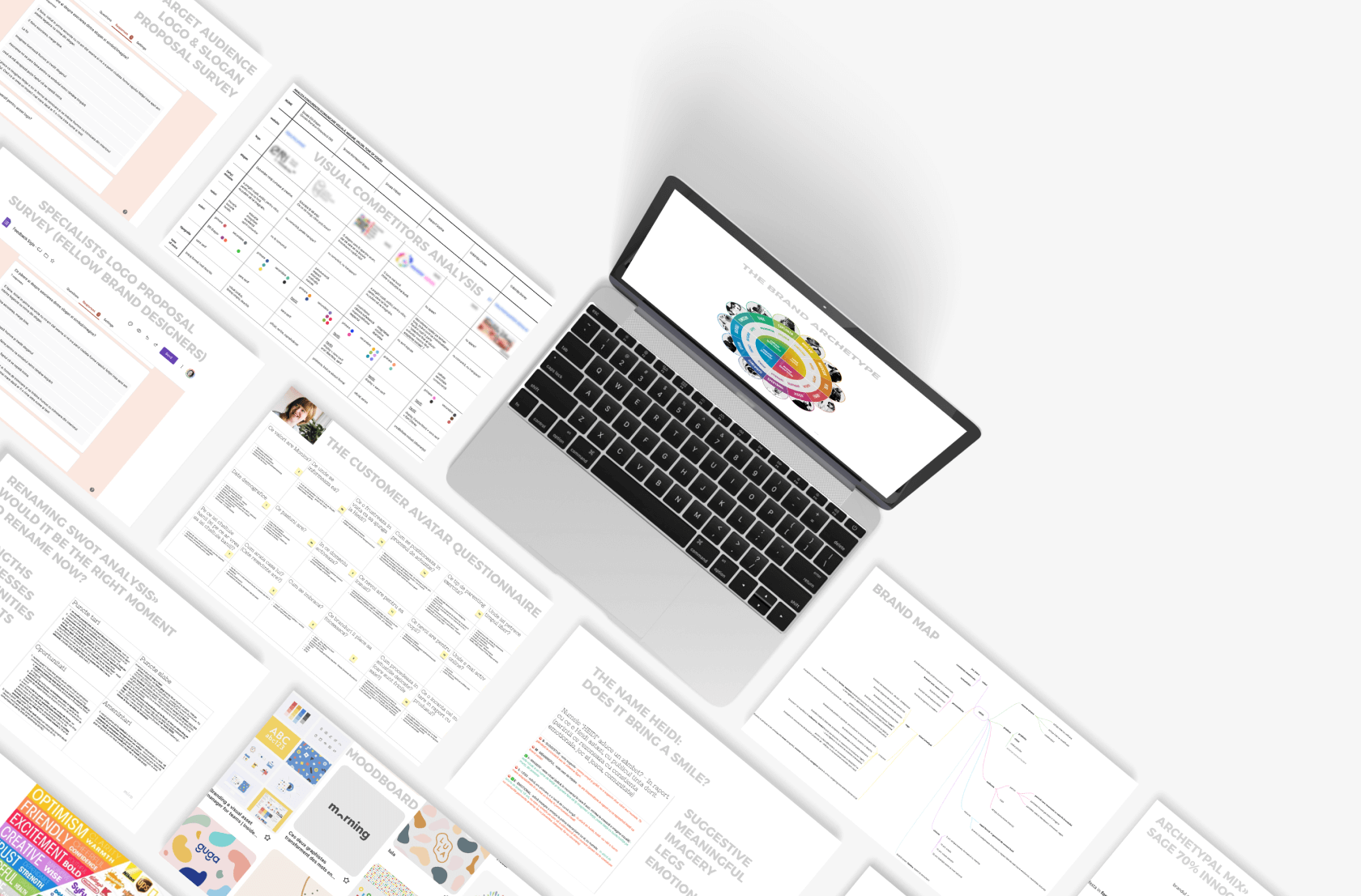
• the competitors visual analysis (brand comm)
• the customer avatar questionnaire (refining the ideal user)
• HEIDI name analysis (according to the SMILE naming principles)
• renaming SWOT analysis (would it make sense now?)
identifying the brand archetypal mix (sage, most dominant)
• putting together the brand map (mission, vision, values, products,
people, public, personality, archetype)
• mood-boarding for the logo to come
• sending surveys to the target audience (5-10) on the logo & slogan proposal
• sending surveys to specialists (5 brand designers) on the logo proposal
• all surveys had anonymous responses
The Research
First step: our Brand Sprint Workshop: 3 stakeholders - including Daiana, and me as the facilitator. Almost 3 hours later: we identified the values and the brand reason of being. We put the pin on the most relevant audience segment. We also detected some pain-points. We had the conclusion that the naming did not represent
the brand.
Next steps that followed:
• the competitors visual analysis (brand comm)
• the customer avatar questionnaire (refining the ideal user)
• HEIDI name analysis (according to the SMILE naming principles)
• renaming SWOT analysis (would it make sense now?)
identifying the brand archetypal mix (sage, most dominant)
• putting together the brand map (mission, vision, values, products,
people, public, personality, archetype)
• mood-boarding for the logo to come
• sending surveys to the target audience (5-10) on the logo & slogan proposal
• sending surveys to specialists (5 brand designers) on the logo proposal
• all surveys had anonymous responses
The Strategy
Ok, so - after all the research, we came to the conclusion that renaming would not make sense now. The rebranding to be created at the moment would be an incremental change towards a renaming that would come in 5 years from now, when creating a school would be added to the business. This strategy would decrease aversion towards change.
What was left now, to build up strength in expressing the brand values? To improve on the slogan. And to come up with a powerful symbol for the new logo - one that would connect with both brand values, and with the current name, Heidi.
We needed a slogan and a logo that would express that Heidi puts a lot of heart into everything they do. Their reason for being is nurturing happy children, leading to self-aware adults, and healthy generations to come.
And we did that with a lot of playfulness.
The Results
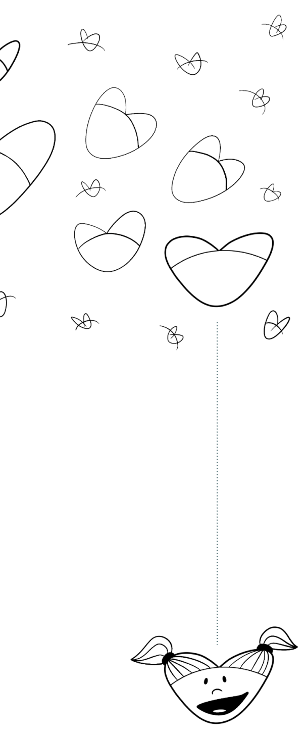
This was the first draft of the new concept: the little girl in the old logo, redone, in the shape of a heart.
After several slogan proposals, the winner wordplay was brought to the table by Daiana herself. I find this kind of synergistic creative victory very rewarding.
The translation of the slogan in English would be something like: “We put our heart in everything” - but the Romanian version has some extra nuances to that. The slogan invites imagination in its visual formula, using the heart symbol instead of the homonym word.
The rebranding brings a lot of authenticity to the brand values, the brand personality, and even the dialogue with Heidi's target audience. Abstracting the little girl into the heart symbol brings the current concept closer to both sexes. The power of the concept lies in the link between text and image - through the slogan and logo symbol. This concept has a wide pliability in various planes.
Behind The Scenes
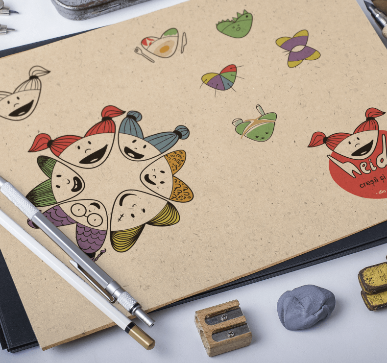
Here you may observe some of the draft concepts at the beginning of the creative process.
We debated, the modified, then got to something closer to what we wanted and what the re-branding needed.
After some iterations and some feedback received from both specialists and the target audience, we got to the final logo.
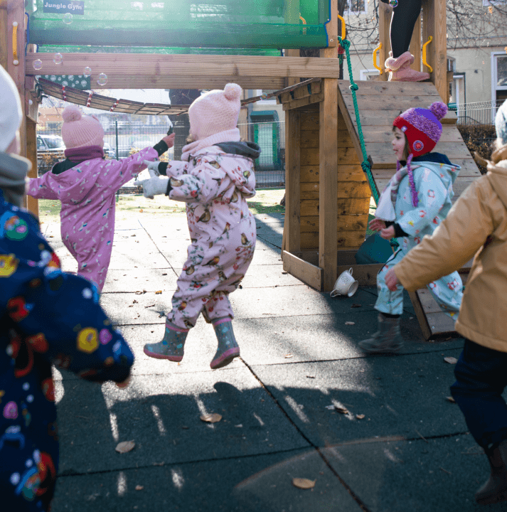
Some of these elements have been used in the revealing campaign. The engagement was significant. As a celebration, a coming of ageparty was organized. Some photography can be seen below.
Let’s Brand The Buildings
Before the re-branding, the buildings were called simply: block A and block B. After putting some soul into everything visual, we have decided we also need the buildings to be aligned. Considering there’s one smaller and one larger building- we came up with this visual formula. “Inima” in Romanian is “heart”, “MA” are the first 2 letters in the word “big” (mare) while “mi” are the first 2 letters in the word “small” (mică).
And we all know “Iniminimanimo”. I came up with the visuals and then Daiana came up with the names.
We went even further with this word play, on the interior maps for the buildings’ levels - for “semi-basement” the word in Romanian is “demisol” - and we put some soul in it: “demisoul”.
The Rebranding Workshop
The output of the rebranding process was gathered in a brand book. The book's beautiful challenge was keeping a humane tone of voice throughout the whole manual - while also having the needed technical touch.
In December 2022, I visited the kindergarten. The purpose of the visit was a visual identity workshop for the executive team (3 members out of 60, to pass on the relevant know-how).
I must admit it was a bliss to see the whole rebranding - alive.
The hallways are now just like a children’s art gallery. Everything is coming together, sitting in minimal, passepartout frames. The brand values transpire even in the interior design, with a focus on love, play - and white space.
By the end of the workshop, everyone involved got a better understanding of Heidi concerning the brand values, brand personality, tone of voice, target audience, and brand recognition. They also understood why it is so important to have coherent brand communication - with the support of brand language (color, typography, photography, iconography, illustration). And, last but not least, they were briefed on how to handle technicalities for various production methods.
The Next Steps
During the workshop, we provided the in-house PR and social media manager with the knowledge needed to manage their Canva posts without affecting the rebranding effort. Nowadays, Canva allows non-designers to have lots of autonomy, making it a very powerful tool. To demonstrate its capabilities, I prepared some templates and provided hands-on explanations for what was acceptable and what was not. (For example, many small brands seem to be drowning in a Canva soup, sacrificing uniqueness in style.) The next step in the process is implementing the brand, with a strong focus on social media.
In about two years, the plan is to remove the main colors from the visual identity and to use only the secondary color scheme for the logo. This has been the plan from the start, and dimming the red and black to what the logo is now is just a step in this process. The Petrol Blue will remain, but only for text.
And, of course, the next step from that will be the renaming, when the school is created. Keeping the brand values, mission, tone of voice - we will only adjust on the name and logo symbol.
Brand Values
• play
• emotional awareness
• community
Audience Segment
• parents
• children
• educators
What does the brand do?
• Main: kindergarten & nursery
• Secondary: daily activities workshops for babies
• Related brand: daiana.org - children therapy, counseling, other products
Service Provided
• the Brand Sprint Workshop
• research
• brand strategy
• brand identity (rebranding)
• brand book
• signage & mapping, interior & exterior
• misc print & digital materials • social media posts concept & design
All the visual assets presented in this case study are the intellectual property of
Grădinița Heidi Ⓒ All Rights Reserved.
Thank you for allowing the use of the imagery to showcase my work.
Credits to mock-up creators and unsplash.com photographers for putting their work out there.
Many thanks - my portfolio looks pretty also because of you.